
大家都在搜


9. The profile plot essentially represents the average density value across a set of horizontal slices of each lane. Darker blots will have higher peaks, and blots that cover a larger size range (kD) will have wider peaks. In our example western blot, the bands are perfect rectangles, but you will notice some slope in the profile plot peaks, as ImageJ is applying a bit of averaging of density values as it moves from top to bottom of each lane. As a result, the sharp transition from perfect white to perfect black on the bands of lane 1 is translated into a slight slope on the profile plot due to the averaging.
10. On our idealized western blot used here, there is no background noise, so the peak reaches all the way down to the baseline of the profile plot. In real western blots, there will be some background noise (the background will not be perfectly white), so the peaks won’t reach the baseline of the profile plot (see figure 5 above). As a result, each plot will need to have a line drawn across the base of the peak to close it off.
11. Choose the Straight Line selection tool from the ImageJ toolbar. For each peak you want to analyze in the profile plot, draw a line across the base of the peak to enclose the peak (Figure 7). This step requires some subjective judgment on your part to decide where the peak ends and the background noise begins.
12. When each peak of interest is closed off with the straight line tool, switch to the Wand tool. We will use the wand tool to highlight each peak of interest so that Image-J can calculate its relative area+density.
13. We will start by highlighting the loading-control bands (lower row) on our example western blot. Beginning at the top of the profile plot, use the wand to click inside the 1st peak (Figure 15). The peak should be highlighted after you click on it. Continue clicking on the loading-control peaks for the other lanes. If a lane is not visible at the bottom of the profile plot, hold down the space bar and click-and-drag the profile plot upwards to reveal the remaining lanes.

14. When the loading control peak for each lane has been highlighted with the wand, go to Analyze>Gel>Label Peaks. Each highlighted peak will be labeled with its relative size expressed as a percentage of the total area of all the highlighted peaks. You can go to the Results window and choose Edit>Copy All to copy the results for placement in a spreadsheet.

15. Repeat steps 13 + 14 for the real sample peaks now. We are selecting these peaks separately from the loading-control peaks so that those areas are not factored into the calculation of the density of our proteins-of-interest. As before, use the Wand tool to click inside the area of the peak in the 1st lane, then continue clicking inside the peaks of the remaining lanes. When finished, go to Analyze>Gel>Label Peaks to show the results. Copy the results to a spreadsheet alongside the data for the loading-control bands (Figure 17).

Data Analysis with loading-control bands
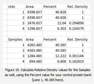
1. With all of the relative density values now in the spreadsheet, we can calculate the relative amounts of protein on the western blot. Remember that the “Area” and “Percent” values returned by ImageJ are expressed as relative values, based only on the peaks that you highlighted on the gel. Start the analysis by calculating Relative Density values for each of the loading-standard bands. In this case, we’ll pretend that Lane 1 is our control that we want to compare the other 3 lanes to. Divide the Percent value for each lane by the Percent value in the control (Lane 1 here) to get a set of density values that is relative to the amount of protein in Lane 1′s loading-control band (Figure 18).

2. Next we’ll calculate the Relative Density values for our sample protein bands (upper row on the example western blot). We carry out a similar calculation as step 1, dividing the Percent value in each row by the Percent value of our control’s protein band (Lane 1 here).
Note: Recall that because some of our loading-control bands were wildly different on the original western blot, we can’t simply use the Relative Density values from our Samples calculated in Step 2 as the final results. Now it is necessary to scale the Relative Density values for the Samples by the Relative Density of the corresponding loading-control bands for each lane. We do this based on the assumption that the proportional differences in the Relative Densities of the loading-control bands represent the proportional differences in amounts of total protein we loaded on the gel. In our example western blot, we have evidence of massively different amounts of total protein in each sample (poor pipetting practice, probably).
3. The final step is to scale our Sample Relative Densities using the Relative Densities of the loading-controls. On the spreadsheet, divide the Sample Relative Density of each lane by the loading-control Relative Density for that same lane.


更有优质直播、研选好物、福利活动等你来!

我的询价
询价列表

暂时没有已询价产品
手机验证